


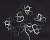
 This is the necklace created after the defeat of the previous version's broken crystal.
  I just LOVE this chinese moonstone crystal, and I think it does soemthing wonderful with the gray thread. It's Lizbeth 20 in silver. Lovely shade of gray, on of my favorite colors to work with right now.
 I could use some opinions on the listing for this necklace.
 I'm trying to step up my photograps, so I'm working on staging and modeled shots etc. When you list an item on etsy, you get five photos per listing, and the first one is what is shown as a thumbnail....and I'm trying to decide which is better as that first pic. It's the picture that needs to grab people and make them want to see more, so maybe if you have a second, you could take a look and leave your opions. I've been featured in a few treasuries, and I got a lot of traffic from that, so I'm working on staging the photos to be more interesting and appealing and artistic. I've ordered a few vintage things like a small mirrored purse, to use in staging the jewelry, so you'll probably see my photographic experiments here in the future.


.jpeg)


.JPG)


9 comments:
That necklace is gorgeous! :)
I like your artistic picture, it's very nice. Maybe you could have a darker fabric/surface below the box and the actual necklace?
Lovely work by the way.
Beautiful necklace! Just suggesting that you use a darker background for the moonstone....many jewellers use sapphire blue or deep burgundy to showcase their jewels. It might make your moonstones glow and sparkle a bit more to have that contrast.
Your work is beautiful!
I would go with the photo of only your neck and the necklace. It clearly shows what you want your target audience to focus on, with no other distractions.
That was the photo that grabbed my attention and that I spent more time reviewing. One can see that the necklace lays well around the neck, that the stones do not hang crookedly, and that the entire design is attractive and well-tatted. Quality work!
.
Your photos are really good!
The light reflecting off the beads in the second one is quite eye-catching. The loose beads are a nice touch; moving them forward a bit would add visual interest to the plain area behind the necklace.
I think the close-up of just the necklace would be best for the thumbnail. The thumbnails are pretty small, so you want a pic that shows a clear image of the item; give it a really obvious title, too, like "Tatted Necklace with Moonstone Crystals". It drives me nuts on Etsy when I can't tell from the thumbnail and title what something is supposed to be, and I usually don't click on it.
Once people have clicked on the thumbnail to get to the actual description, the shot of you modeling it will definitely help sell. People always want to know what it will look like on.
I agree with Michelle that a dark background would really show off this beauty, maybe a midnight blue. You might invest in a half yard or so of cotton fabrics in different solid colors, so that you'll have a choice of backdrops to set off your threads.
Here's hoping for lots of sales!
If you could get a bit of the color that is inside the pretty gold box; that would be lovely for it to languish upon. I also like the one that is worn because it shows how it adorns the neck.
Moonstones are a favorite of mine BTW…I have a lovely moonstone set I bought at a shop downtown. Silver is bead central; everyone (almost) here makes jewelry of one kind or another. Makes it nice when I want a specific sort of bead; all I have to do is get myself together and talk DH or granddaughter into taking me down the hill and getting out the wheelchair. LOL Not always easy to con them into service. It's kind of like hauling your babies around; you enjoy them, but it is a lot of extra work.
It is really nice work..
xx Bev
Hi Krystal,
I love all 3 photos, but for the 1st showcase photo, the one that grabbed me most was the photo # 2 in your post - but I agree with Suztats and Michelle, it should be featured on a dark background; and I think midnight blue velvet would look beautiful.
I'm glad you decided to use moonstone - it's more beautifully structured than your previous piece - kudos on all of it.
I don't know much about photography myself, but I know that is what I would like to see.
Hope my opinion helps in some way.
Ah thank you all for the wonderful input! I've been hashing over much of this lately, and while I do agree that the moonstone would be featured better on a dark background, there is also the argument about the shop having a cohesinve look and feel to the photos. So much to think about! My thought thus far is to choose a few fabrics or painted boards to display things on. I always welcome the friendly critique! I'm taking notes so I can consider all these opinions as I work on the shop.
Post a Comment